
Segment report#
This text serves as a detailed guide that explains to you, step by step, what the individual charts and tables on the Segment report page mean, why they matter, and how to get the most out of them for pricing, marketing, and purchasing. We’ll go through the page from top to bottom, in the same order in which you see it in the Pricing Fox interface (see the attached screenshots). In the report we always work with 30-day statistics from the chosen data source.
1. Report header#

| Element | Value | Meaning | How to use it | More tips |
|---|---|---|---|---|
| Name | By default, the name is automatically generated in the format ` |
The report identifier. | A filled-in name serves as the main identifier, especially when printing the report (whether to PDF or to a printer). A custom title comes in handy especially if you manage several online stores or want to quickly navigate between different report types. | |
| Statistics source |  GA 4 GA 4  Heureka Heureka  Zboží.cz Zboží.cz |
The logo indicates the data source used for the report’s performance data. By clicking the “pencil” next to the logo, you can change this source.\ Note: The source change applies only to the segment report and will be used each time it’s generated again. |
Choose the statistics you work with most often. To select, you need an active connection, which you set up on the Connections page. | If you have no data in the report or no option to select a source, it may be due to incorrectly paired products or an incorrect input connection. Check the status on the Connections page. |
| Generated | The time when the report was generated. | Based on the time and date of regeneration, you can quickly get your bearings on whether you’re looking at the right report. | Useful especially for printed reports or ones sent by email. Thanks to the time and date in the header, you always know which moment the data displayed in the report relates to. | When analyzing older data or multiple reports, it’s good to take the report’s generation time into account and relate the data to this information as well. |
| Report sending | Setting up automatic sending of the report. | Set up regular daily, weekly, or monthly sending of the report as a PDF to a specified email. | If you need to send the report to multiple addresses, separate them with a comma. | |
| Share | The report’s public address. | If you need to show someone the report but can’t give them access to Mergado/Pricing Fox, you can use the report’s public address. It contains a slightly simplified but live version of the report. | The URL contains a unique hash that prevents unwanted visitors from entering. The report may, however, contain sensitive data, so always be careful about who you share the address with. | |
| The button for printing the report. | After you press it, the system window for printing the report opens in the browser. In the preview window you see how the report will look. | If the appearance doesn’t suit you, we recommend adjusting your printer’s print settings. From the dialog window you can also print the report to a PDF file on most systems. |
2. Report configuration scenarios – “⚙️ Presets”#
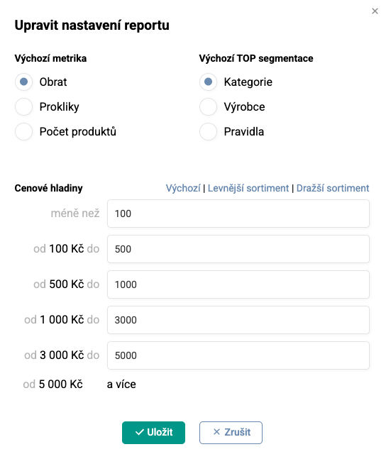
After you turn on the report, the default report metrics are automatically set, and they can be changed using the presets. This preset configuration affects data across the entire report. It’s advisable to adjust the preset configuration right at the start of analyzing the segment report. At the same time, it will accompany you throughout the whole process of going through the report, and you can change the choices without having to always go back to the beginning of the report. In the ⚙️ Presets you can set the following parameters – the default metric, default TOP segmentation, and Price levels.
| Parameter | Possible values | Default value | Changes in the report | When to choose it? |
|---|---|---|---|---|
| Default metric | - Turnover - Clicks - Number of products |
Turnover | The pie charts, TOP segment tables, and other charts across the entire report will display values by share based on the chosen metric. | Turnover - if you analyze the assortment’s performance from a profit perspective. You need to have the statistics sources correctly connected. Clicks – interesting for analyzing costs from price comparison sites or the attractiveness of the assortment according to GA4. Number of products – if you need to take stock of the assortment structure in the feed / in the online store. |
| Price levels | You can choose predefined default values, our preset breakdown for more expensive (or cheaper) assortment, or choose a custom price breakdown. | CZK: 100, 500, 1000, 3000, 5000 EUR: 5, 20, 40, 120, 200 |
All charts and tables of price levels are automatically recalculated according to the chosen boundaries. | If you know your assortment and know which price levels the most interesting products fall into, you can segment the products better using custom boundaries. |
| Default TOP segmentation | - Category - Manufacturer - Rules |
Category | The TOP segment tables will display the selected metric by default. | Worth adjusting especially if you want to have a different segmentation than the default one (Category) sent to your email. |
3. Assortment breakdown#
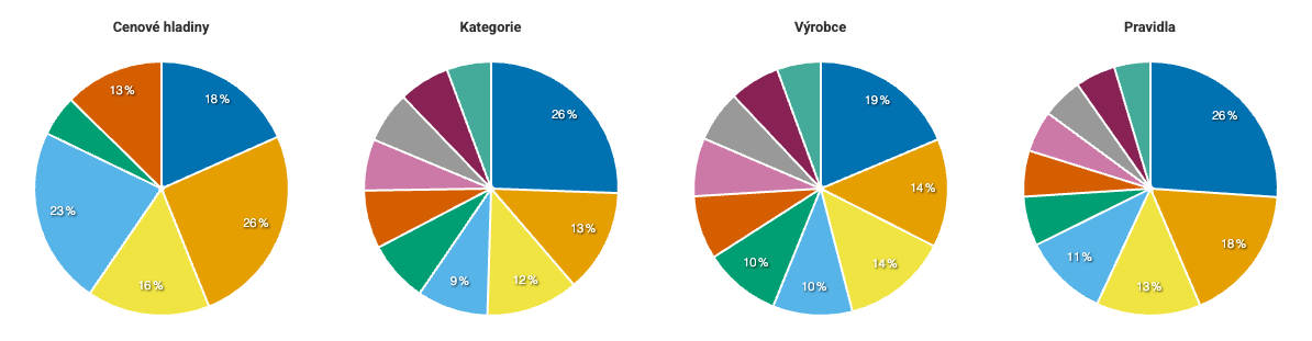
3.1 “⚙️ Metric: Number of products”
| Chart | Element | The question it answers | Typical insight | Practical action |
|---|---|---|---|---|
| Price levels | PRICE_VAT |
In which price bands do you have the most items in your assortment? | The lowest price level dominates. | Adjust your ⚙️ Price levels in the report settings so they better match the distribution of your assortment. |
| Categories | CATEGORYTEXT |
Which categories form the basis of your product portfolio? | One category significantly dominates the assortment. | It may be worth considering greater granularity and creating subcategories. We recommend checking by ⚙️ Turnover whether the largest categories also bring the largest turnover. |
| Manufacturers | MANUFACTURER |
Which manufacturers are most represented in your assortment? | A supplier/manufacturer covers more than 50 % of the assortment. | Check the mechanisms in place for a possible supplier outage. |
| Rules | PRICING_RULE |
According to which rules were your products repriced in the last pricing run? | The most products fall into the fallback rule. | Check whether your segmentation within the rules is still up to date, or whether, for example, mass unpairing of products on the price comparison site is occurring. |
3.2 “⚙️ Metric: Turnover”
| Chart | Element | The question it answers | Typical insight | Practical action |
|---|---|---|---|---|
| Price levels | PRICE_VAT |
In which price bands do your products generate the most revenue. | The most turnover comes from the higher price band -> customers have no problem paying more for quality products. | Expand your premium portfolio. On price comparison sites, try deploying bidding and getting to favorable positions so you’re well seen. |
| Categories | CATEGORYTEXT |
Which categories generate the largest turnover? | Does the level of turnover also correspond to the level of profit? | Check the level of your margin – even a slight increase can lead to a significant rise in profit with large turnovers. |
| Manufacturers | MANUFACTURER |
Which manufacturers contribute most to your store’s turnover? | A manufacturer with a lower margin generates large turnover. | Prioritize, when negotiating with suppliers, those for whom you generate high turnover. |
| Rules | PRICING_RULE |
Which pricing rules generate the highest turnovers? | Do the margins set in the rules correspond to the findings from the rows above? Did you choose a suitable segmentation into rules? | Try increasing the margins directly in the rules with large turnover. |
3.3 “⚙️ Metric: Clicks”
| Chart | Element | The question it answers | Typical insight | Practical action |
|---|---|---|---|---|
| Price levels | PRICE_VAT |
In which price bands do your products generate the most visits. | A price level generates high visit numbers from the price comparison site, and thus high costs too. | Check whether the higher costs are balanced by corresponding turnover. |
| Categories | CATEGORYTEXT |
Which categories attract the highest traffic? | Some categories have low traffic even though they contain a large number of products. | Work on your visibility on price comparison sites – try lowering product prices or improving their position with bidding. Also check whether you’re not deterring potential customers with poor availability or expensive shipping. |
| Manufacturers | MANUFACTURER |
Which manufacturers sell the most sought-after goods? | Apple attracts high traffic, but at the cost of expensive clicks that don’t generate turnover. | Check the correct pairing into cards on the price comparison site (e.g. whether you’re not selling cheaper accessories on phone cards) and also whether anything is blocking the checkout. Check your competitiveness for the given manufacturer and, if necessary, suppress it within the price comparison site (e.g. by cancelling bidding or hiding offers). |
| Rules | PRICING_RULE |
Which pricing rules generate the highest costs? | Do I also have higher margins set for products with higher costs? | Check the settings of your repricing rules and the level of margin. If products generate high costs, they need to be covered by an increased margin or sales volume. |
4. TOP segments and price levels#
4.1 How to read the table#
-
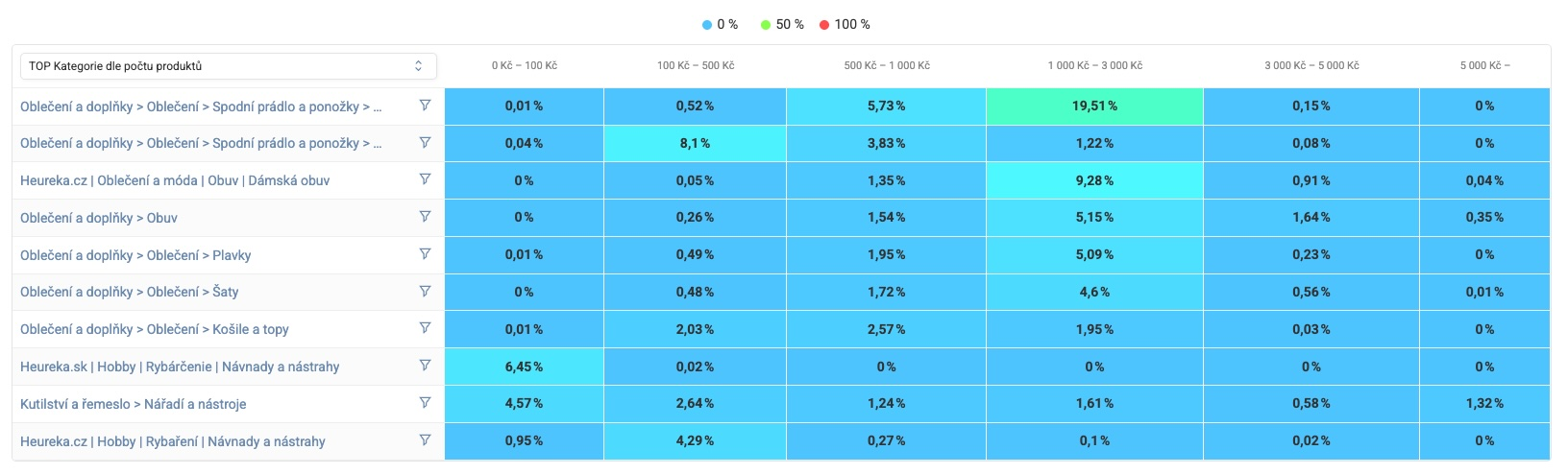
Rows = TOP 10 categories/manufacturers/rules* by number of products/turnover/clicks* (from the highest)
-
Columns = Price levels (sale price)*
-
Cell = the share of the given combination in the whole feed
-
Color scale = from blue, through green, to red (0 – 50 – 100 %). Blue means a small representation, red the maximum.
*can be adjusted in the report settings, see ⚙️ Presets
4.2 What to watch for#
-
Color concentration: If you see one strongly colored column in one tone of the listed colors (blue/green/red), a large part of the assortment is price-“clustered” in one band –> potential for price spread and upsell.
-
Empty bands: 0 % suggests an opportunity to fill in the price range (e.g. an entry-level variant is missing).
-
Long rows of the same color: If too many cells are colored in blue/green shades – the share of products is distributed across several price levels and none of the price levels dominates. So there’s a wide price spread between products, which means the assortment contains both premium and cheap variants. This gives you the possibility to work with differentiation in marketing, bidding, and pricing analysis:
-
Marketing – can be used for stratifying products in marketing. Low-end items – prepare, for example, attractive discounts or include them in your discount campaigns on social media. High-end items – attach a free gift or another exclusive bonus.
-
Bidding – can be used when assigning different bidding limits for different price levels to larger groups of products. A higher bid is suitable for more expensive variants, and a more moderate one as the price level decreases.
-
Pricing – the assortment can, for example, be divided into subsegments and you can create different price strategies and goals, or work out different margin levels. Likewise, you can try A/B testing at similar price levels.
-
5. Comparison of TOP segment performance#
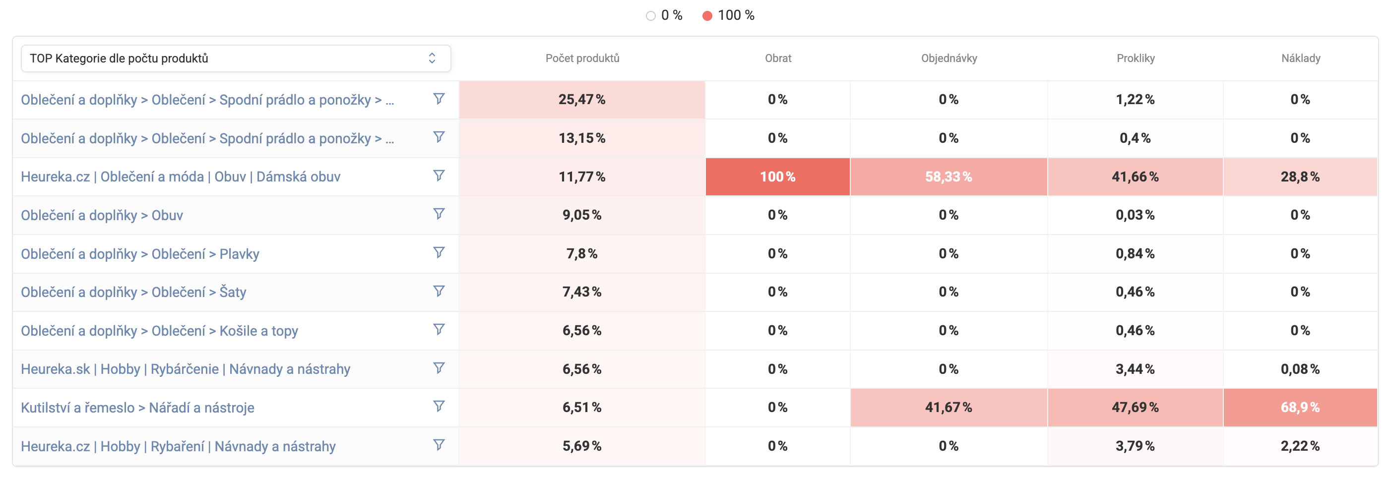
The table extends the previous matrix with performance KPIs – turnover, orders, clicks, and costs. Using the drop-down menu above the table, you can choose the type of segment you’re interested in:
-
TOP categories by number of products/turnover/clicks
-
TOP manufacturers by number of products/turnover/clicks
-
TOP rules by number of products/turnover/clicks
-
Price levels by number of products/turnover/clicks
Note: In the analyses we work with data according to the metric chosen in the ⚙️ Presets settings. You can switch the metric at any time between Number of products, Turnover, or Clicks, with all charts and tables adapting automatically.
5.1 How to read it#
-
Rows = TOP 10 segments by the chosen metric (category/manufacturer/rule/price level; you set it directly in the table above the first column)
-
Columns = performance metrics (number of products, turnover, orders, clicks, costs)
-
Color scale = the intensity of the red color; a more pronounced tone indicates a higher share of the chosen metric within the TOP segments (of the given column)
5.2 How to use it#
-
Comparing volume vs. turnover: Some categories or manufacturers may have a relatively low share of products and yet contribute significantly to turnover – this signals premium products for which it may pay off to increase the margin.
-
Identifying an inefficient segment: If one of the listed metrics (e.g. a rule or category) covers a large number of products but generates few clicks, orders, or turnover, it’s a candidate for:
-
a price review,
-
advertising optimization – descriptions and images (TIP: for automated and effective image marketing, we recommend trying the Mergado extension Feed Image Editor free for 30 days. Read the case studies HERE.)
-
or removal from the assortment.
-
-
Changing segmentation as needed: If you switch from category to manufacturer, you immediately see which suppliers are just “feed fillers” vs. which bring in revenue.
-
Campaign targeting: Based on the performance of the individual price levels, you can decide whether it pays off to invest in promoting low-end products or rather to scale the mid and premium products.
-
Comparing volume vs. turnover: A category may have a low share of products but high turnover –> these are premium, profitable items.
-
Quick identification of the inefficient mass: A high number of products + low turnover = a candidate for removal, archiving, or price review. Improve your price strategies by reviewing your Rules in Pricing Fox. If you don’t know how to handle business strategies, contact our certified specialists.
5.3 A practical TIP#
A tip from the ROI (return on investment) perspective:
-
The ratio between turnover and costs: Create an analysis using the performance data in the table. Focus especially on the assortment that falls into the segment with the best PNO (cost-to-turnover ratio).
-
Hidden potential: A low number of products + high turnover = an opportunity to expand the offer (conversely – low turnover may signal a low return and needlessly clog the feed and marketing budget, or even the overall costs)\
Tips for further strategies:
-
Uniformity of performance: Watch out for the risk of dependency with an uneven distribution – too great a concentration can cause the risk of dependency on a certain segment according to the chosen metric and thus creates instability in your performance. Nevertheless, this makes it possible to identify the so-called core business, thanks to which you can analyze what to focus on in the future and which segments are unprofitable for your business. (E.g. if there are 10 categories but only 2 of them create 80 % of turnover and 8 make up 20 %, this is too uneven a performance of the online store). If, in such a case, one of your TOP categories drops out – you lose 50 % of your core business – so keep your assortment in a uniform distribution for performance.
-
Margin vs. Volume: Segments with a small volume but a high margin are worth keeping, even when the volume is at a low level. The individual items in such a segment generate significant profit despite a small share. These are mostly premium or branded products. Often these products are found in the assortment in single units (e.g. 20 types of products in the “specialized tools” category). You’ll see these products in the report with a low count for the “number of products” metric, but for the “turnover” metric they’ll be at higher levels. Conversely, volume products (for example screws, which are sold in hundreds or thousands of units) will show high levels for “number of products” but low ones for turnover.
6. Segment battle – Manufacturer ✦ Category#
Finding the best combination of Manufacturer ✦ Category in your segment.
6.1 Bar chart (TOP segments)#
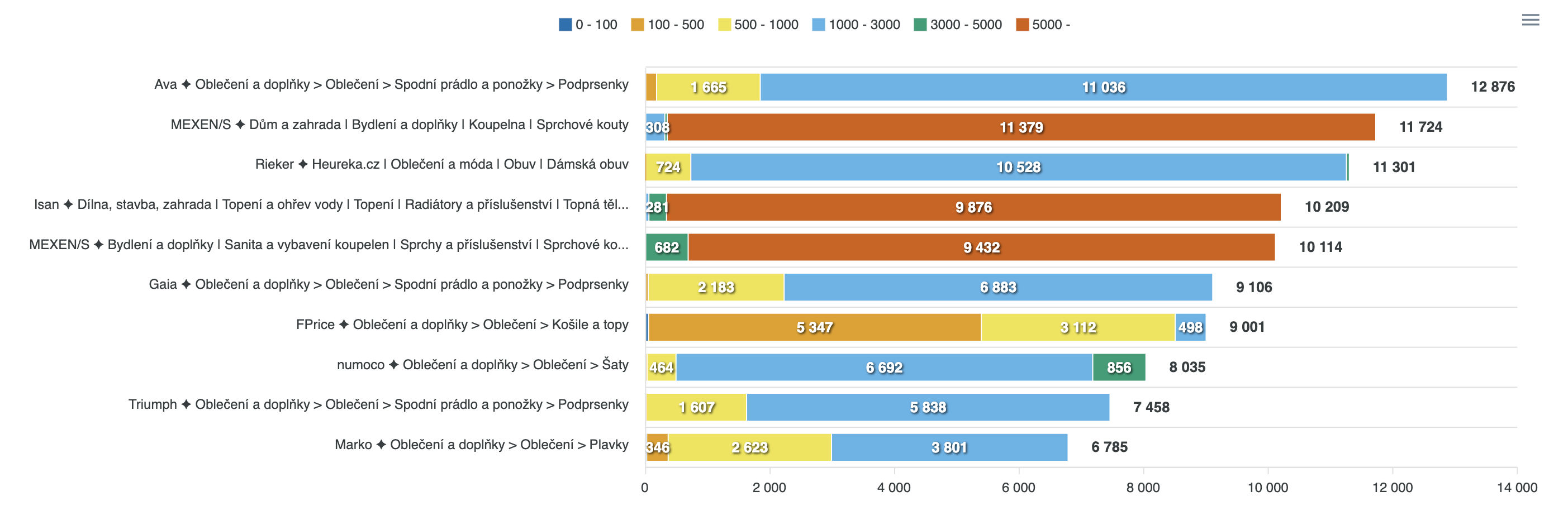
The horizontal bars represent the TOP 10 combinations of Manufacturer ✦ Category by the metric chosen in the ⚙️ Presets. The segments of the bar are sliced by price levels (see the color legend above the chart).*
6.1.1 How to read it
-
Bar length = the absolute count of the chosen metric – the numerical value at the end of the row.
-
Color distribution = the price distribution in the given combination – the numerical values in the individual color bars.
*All the data in the charts is automatically displayed according to the selection in the ⚙️ Presets settings – the possible metrics are number of products, turnover, or number of clicks.
6.1.2 How to use it#
It lets you quickly reveal the most productive part of your store’s assortment.
| Scenario | Signal in the chart | Action |
|---|---|---|
| A manufacturer offers only low-end | The whole bar is 0–100 CZK | Introduce more expensive assortment –> improve the average margin. |
| Two manufacturers’ prices overlap in the same category | Two similarly colored bars | On the price comparison site, highlight unique benefits so offers don’t cannibalize each other. |
6.2 Bubble chart (Turnover × Clicks × Number of products)#
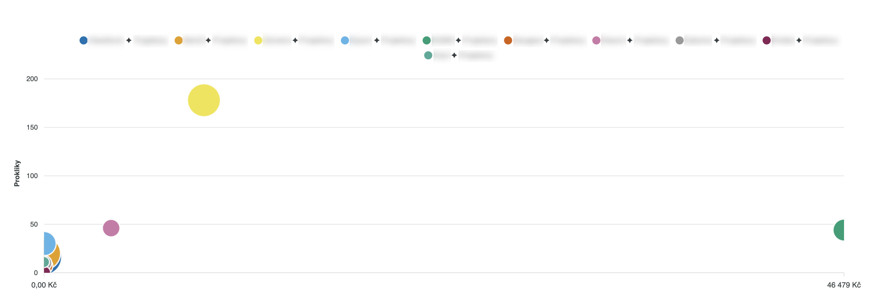
If data from statistics measurement is available*, Pricing Fox displays the individual TOP segments (Manufacturer ✦ Category) as bubbles, where:
-
the X axis (horizontal position) = turnover
-
the Y axis (vertical position) = number of clicks
-
the Z axis (bubble size) = number of products
*Set the source of statistics measurement in the report header. You can choose data from Google Analytics 4, Heureka.cz/sk, or Zboží.cz, depending on which sources you have configured on the Connections page.
6.2.1 How to read it#
If the bubbles are positioned:
-
Top right = a profit engine (high turnover and high CTR).
-
Top left = visibility without conversion –> adjust the final price or a UX detail of the page.
-
Bottom right = low traffic but good conversion –> invest in promotion.
-
Bubble size = indicates the number of products found at the intersection of the Manufacturer ✦ Category metric.
6.3 Treemap “Segment share of the whole”#
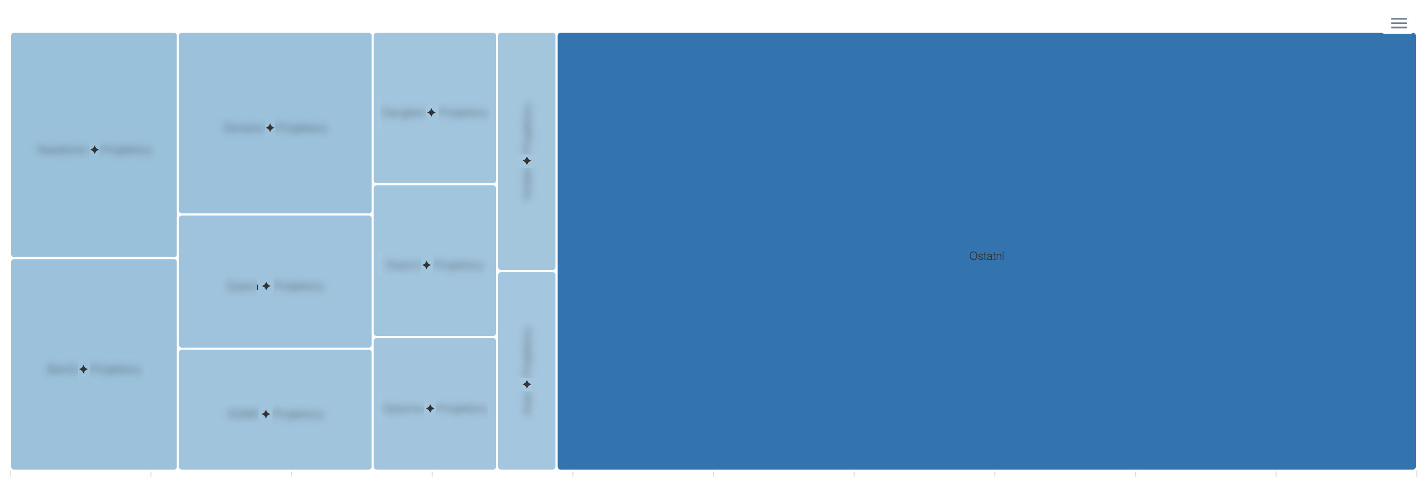
The size of the rectangle shows the ratio against the TOP segments and the other products.
6.3.1 When the treemap helps#
-
Overall view: Compare the performance (or number of products) in the TOP segments against the whole.
-
80/20 analysis: Verify whether 20 % of the segment really makes up 80 % of turnover.
6.3.2. Tips for analysis#
-
The “Other” rectangle: If this rectangle takes up most of the chart’s area, it means that most of the turnover (with the “Turnover” metric set in the “Presets” option) doesn’t come from the displayed TOP 10. This signals that you have performance distributed across a higher number of segments and there are therefore no clear stars in your assortment.
-
Large rectangles in the chart don’t necessarily signal only high turnover. Along with it, they can also signal the risk of dependency on a specific supplier (or manufacturer) or too narrow a focus of the assortment. Consider your options for diversifying the assortment to reduce risk in case one of the suppliers drops out.
-
Small rectangles – this phenomenon is called the “long tail.” In such a case it pays off to analyze which of these micro-segments can be scaled (try, for example, expanding the offer or strengthening advertising campaigns to support the growth of a potential segment) and at the same time to identify which of them creates too high a cost (and is thus a candidate for removal from the assortment).
Further links#
Don’t miss your feed’s potential – all it takes is one good insight#
Do you want to get the most out of your data and never miss another chance to beat the competition? -> Connect with our certified specialists, who will help you with interpretation as well as strategic setup.
I WANT AN INSIGHT FROM AN EXPERT
And if you’ve come across any uncertainties or shortcomings, or you’re just not sure you’re reading the data correctly, write to us at – podpora@pricingfox.cz, we’ll be happy to help.
FAQ#
Why don’t I see data about turnover or clicks in the report? Performance data (turnover, clicks, orders) is displayed only with an active connection to a statistics source – GA4, Heureka, or Zboží.cz. Check the data source in the report header and verify on the Connections page that the relevant connection is active.
How do I set custom price levels? In the ⚙️ Presets section at the top of the report, click Price levels and choose the custom breakdown option. Enter the boundaries corresponding to your assortment – the report is immediately recalculated according to the new breakdown.
Can I have multiple segment reports for different projects? Each project in Pricing Fox has its own segment report. If you manage several projects, switch between them in Mergado – each project has its independent report with its own configuration and data.
Can I share the report with someone without access to Pricing Fox? Yes. In the report header there’s a Share button that generates a public URL with a live version of the report. The address can be sent to anyone – they can access the report even without logging in. You can also set up regular sending of the report as a PDF to an email.